Responsive Web Design?
What is responsive design?
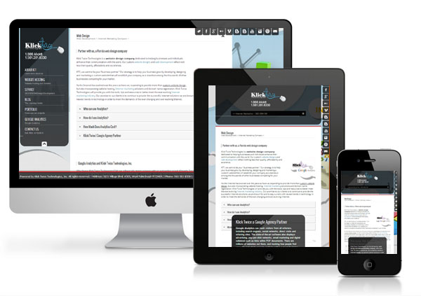
So what is Responsive Design? In simple terms, Responsive Design is making sure your design responds to all environments, from mobile, to tablet, to browser, and even television screens, ensuring your design displays the most important content, comparable to the amount of viewing area now needs to be considered on all web design moving forward. Let's take a look at some websites that take Responsive Design into consideration and discuss why you would want to design responsibly and the concepts, and techniques that make up Responsive Design.When you think responsive, you generally think fluid, and a layout that scales from large to small as the browser resizes.
Let's take a look some of the features first, the most important, the content. As we begin to resize our browser, the content begins to scale, items start getting smaller, yet all the content is still visible. If you scroll down the page a little bit to where you see even more of the content area and then begin to resize down even further, we can see some shifting taking place. Content that was smaller in the right sidebar now becomes bigger and is part of the main content flow. As you continue to resize your browser down to what we would expect to be the view in an iPhone or in Android device, we can see that those images and content take even more focus, and the content becomes more important.
Also, if we take a look at the menu, the menu has completely changed. These are all responsive characteristics. As you begin to expand the site out, you can watch the menu change back into what we expect menus to look like. And if you keep going even wider,you can notice that the menu itself starts to get larger. And if you hover over items, the dropdown effect that displays even more content. So taking that in mind how does the page exactly react to smaller screen sizes? This is one of the major implementations of Responsive Design, known as a Media Queries, the ability to detect screen sizes, and then manipulate the CSS Hide, Show, or Scale content accordingly.
Another concept you may have seen is moving from a fixed-width pixel-based design to a percentage based fluid design so that this layout scales according to the browser itself. Finally, how about the images and how they scale? This is another common responsive characteristic that we're seeing in the mobile sphere.